
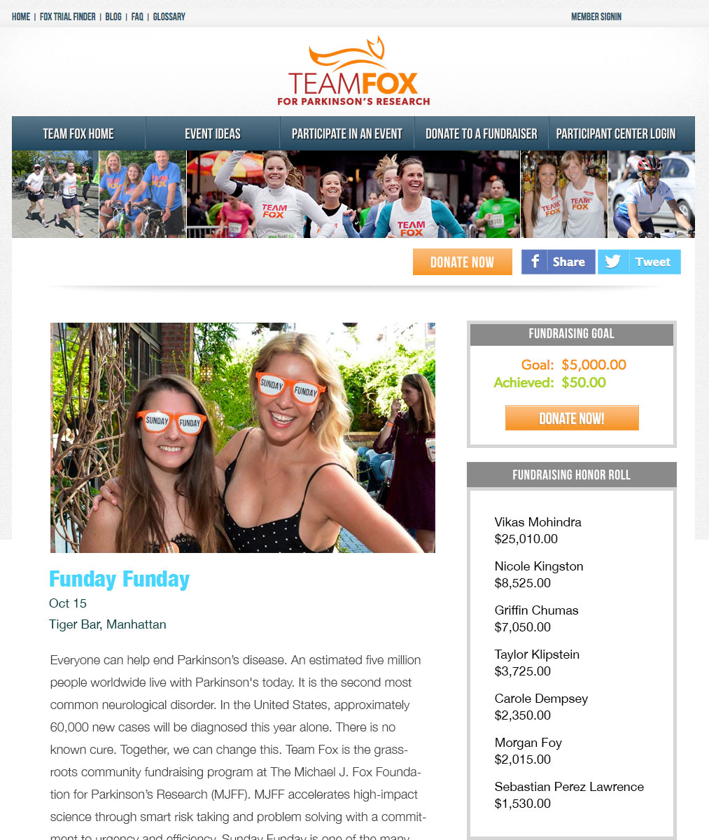
As part of the digital strategy team at The Michael J. Fox Foundation for Parkinson’s research, I was responsible for the UX and UI of the foundation’s marketing site, as well as the online fundraising platform (Team Fox) which allows people to fundraise on behalf of the foundation. One project we were tasked with was to improve the fundraising pages that were provided to Team Fox members. They could customize their pages, but the out-of-the-box layout needed work.
The Challenge
The whitelabel fundraising platform we were using had to support a wide variety of event types and a diverse demographic of users.
Our goals were to:
- Increase social shares
- Improve the discoverability of fundraising events
- Increase donations
Insight
To start the project, our team met with the stakeholders and the Team Fox leaders inside the foundation to gather intel and define their goals and expectations. By directly engaging with the Team Fox leadership we were able to move forward quickly to build personas and establish direction.
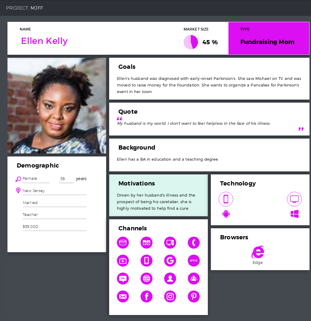
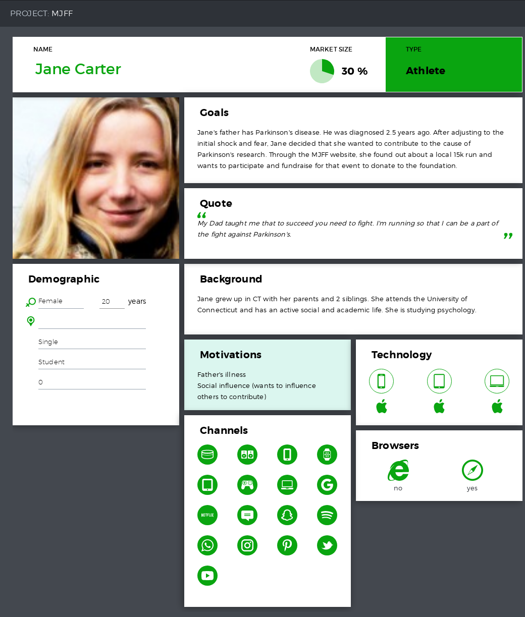
I led the team in the creation of user personas which helped us define our audience and provided insight into the behavior of our fundraisers. With input from the Team Fox leader, I interviewed 5-10 Team Fox fundraising members and, in addition to establishing biographical information, I asked them a series of questions about the way that they were fundraising, how satisfied they were with the existing tools, and what things they felt could be improved.
We developed two primary personas to focus on for this project. Although Team Fox members range in age from kids as young as 7 who set up lemonade stands up to 75 year-old marathon runners, we established that the two personas we would focus on represented the majority of fundraisers using the platform.
Our interviews also gave us our primary pain points:
- Fundraisers reported that the page design of their events made it hard to find the donate button (!)
- There were no social sharing tools to allow visitors to spread the word about their events
- The page navigation was confusing which led to people leaving before donating
- The website made it hard to find upcoming events
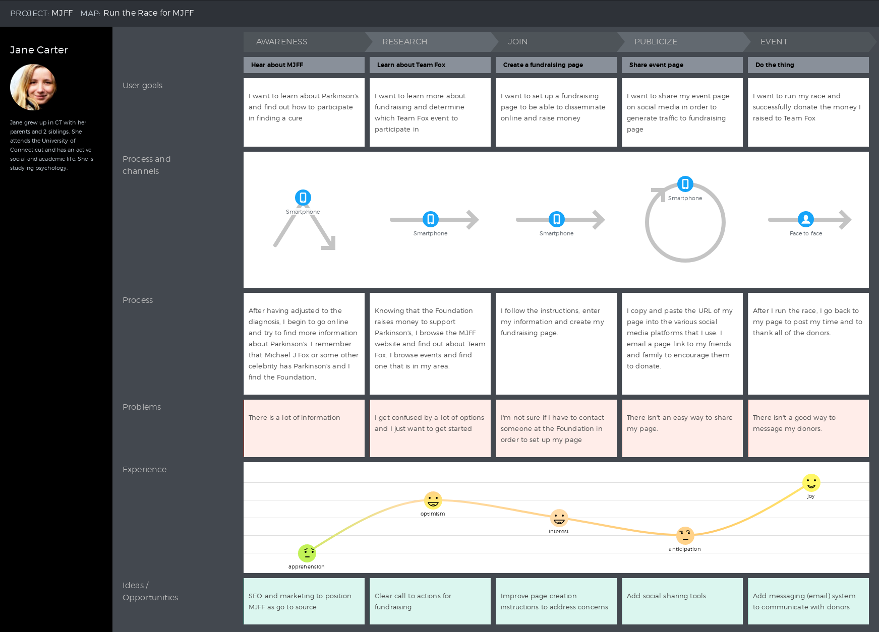
I also led the team in a brief workshop with the purpose of generating a high-level customer journey map of the process by which a Team Fox runner might sign up for and fundraise for a Team Fox event.
Iterations
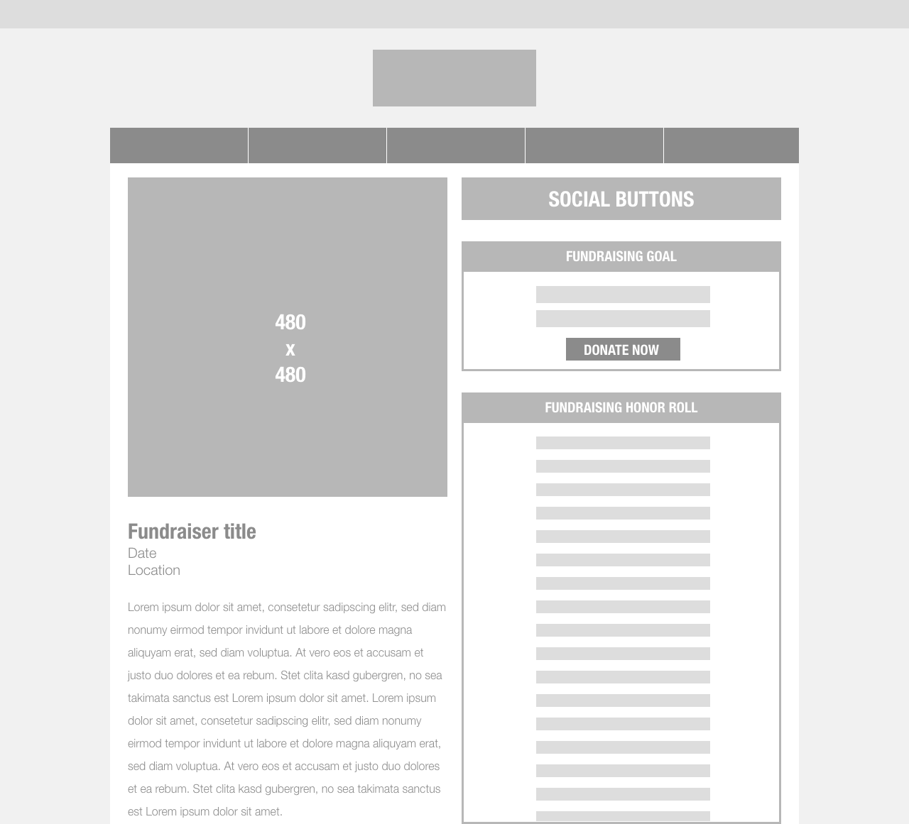
Once we knew who we were designing for and what were looking to fix, I began to sketch out wireframes and build some lo-res HTML prototypes to get feedback internally. I designed a new page wrapper for the fundraising pages, and our team designed an “upcoming events” calendar on the foundation’s website to increase the visibility of Team Fox events.
Improvements
After the improvements to the fundraising pages and the website, we saw a meaningful increase in user satisfaction, overall ease-of-use, and social shares, which we measured through analytics and user surveys. We also saw an increase in page views on the fundraising pages which we tracked directly to the increased visibility on the website.